
Key Points
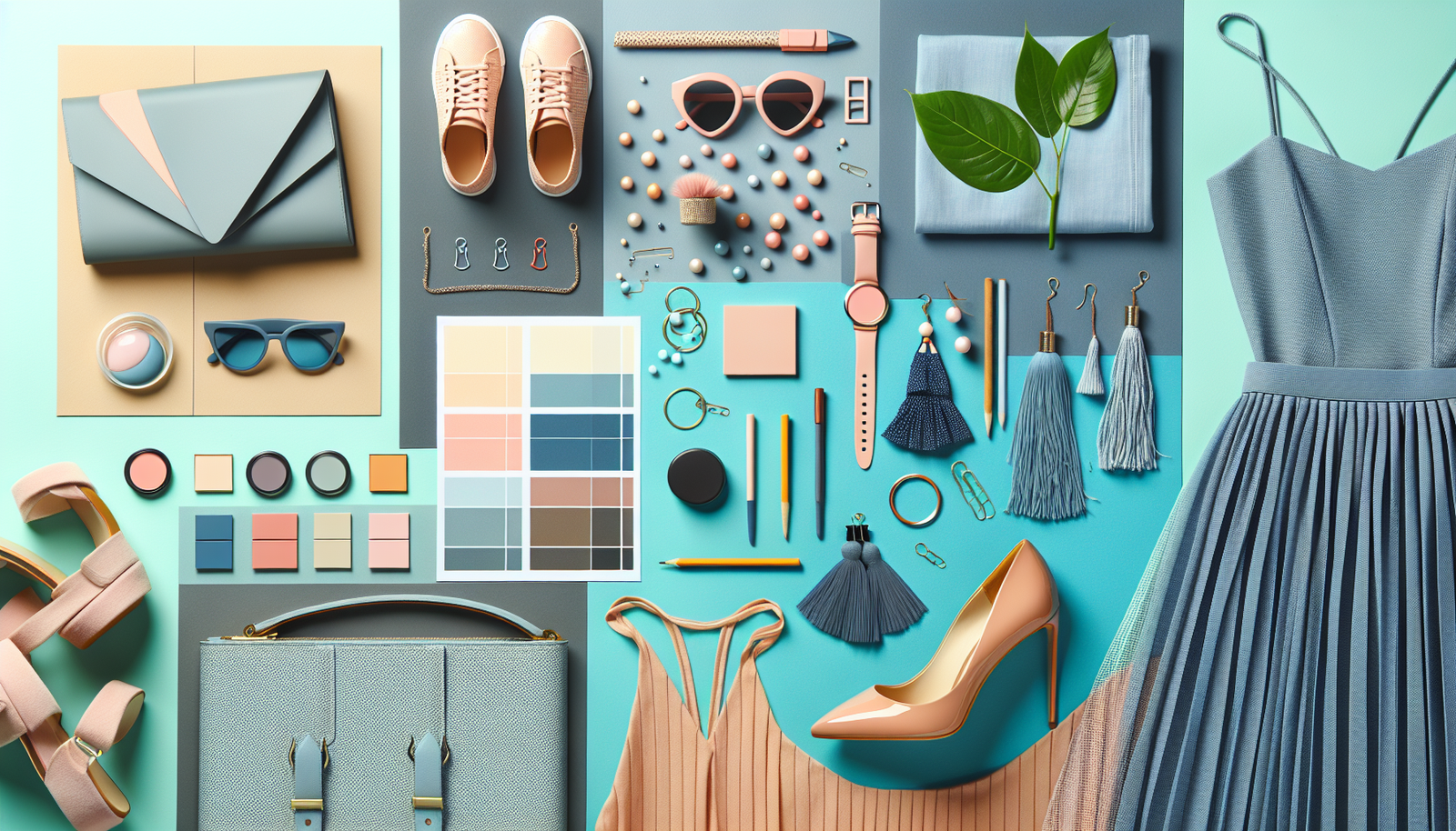
- Choose Your Base Colors Wisely: Start with neutral base colors to create flexibility in your outfits and decor.
- Understand the Color Wheel: Use the color wheel to explore complementary, analogous, and triadic color schemes.
- Play with Textures and Patterns: Don’t shy away from mixing patterns and textures for richer, more dynamic color combinations.
Choose Your Base Colors Wisely
When it comes to color coordination tips, selecting your base colors is like laying the foundation of a house. You wouldn’t want to start building without a solid ground to stand on, right? In my experience, neutrals are your best friends. Think blacks, whites, grays, and beiges. They offer a canvas to showcase pops of color, allowing you to change your accents without overhauling your entire wardrobe or home decor every season. Imagine pairing a crisp white shirt with a vibrant red scarf or splashing turquoise cushions on a beige sofa. It’s all about that balance! I’ve found that having about three or four neutral pieces—like a classic little black dress, gray blazer, or taupe trousers—gives you the freedom to accessorize in ways that can transform your look instantly. Ever thought about how easily those neutral bases can work with warm yellows or cool blues? It’s really a game-changer.
Layering Neutrals
Layering different shades of neutrals can add depth without going overboard. Imagine a light gray top with dark gray trousers and a beige coat—sophisticated yet simple!
Understand the Color Wheel
Look, let’s get into the nitty-gritty of color theory for a moment. The truth is, understanding the color wheel can take your style from ‘meh’ to ‘wow!’ Ever wondered why some colors just seem to ‘pop’ when paired together? It’s all about complementary colors. They’re opposite each other on the color wheel. For example, blue and orange are opposites yet they’ve got a synergy that catches the eye. On the flip side, complementary colors can also be a bit much if you throw ’em together haphazardly. A great trick? Stick to one bold color and use its complement as an accent. When I want to feel adventurous, I often go for an outfit that’s primarily one color—like a deep burgundy—then sprinkle in some moss green with my accessories. The result? It’s chic and purposeful. Understanding analogous colors—those next to each other like blue, green, and teal—can also create a harmonious look without feeling overwhelming. Want a seamless blend? Pick three hues that are neighbors on the wheel, and watch your style transform in no time!
Color Psychology
Colors evoke feelings—did you know that? Wear bright yellows for cheerfulness or blues for tranquility. Trust me, it makes a difference!
Play with Textures and Patterns
Here’s the deal: color isn’t just about getting the shades right; it’s also about how those colors interact through textures and patterns. You might be thinking, patterns? Isn’t that risky? Well, in my experience, mixing textures can create an eye-catching ensemble. Think about a chunky knit sweater, silky skirt, and leather boots—every piece brings something different to the table. Just be mindful to keep your color palette in sync. I often gravitate towards florals or stripes paired with solid colors. For instance, if you’re rocking a patterned top, consider grounding it with a solid pair of pants. It helps break things up and keeps you looking sophisticated instead of chaotic. Sound familiar? For home decor, it’s just as crucial. Try layering a velvet pillow with a linen one in similar colors; it’s cozy and visually appealing without being too matchy-matchy. Remember, it’s all about having fun with it and allowing your personality to shine through your coordination choices!
Finding Your Own Style
Mixing textures and patterns is personal—don’t be afraid to try unexpected combinations! Trust your instincts and wear what makes you feel good.
Leave a Reply